先使用Vue-cli3脚手架创建项目
yarn global add @vue/cli

创建项目
vue create antd-demo
安装ant-design
yarn add ant-design-vue
跑起来
yarn serve

yarn build
开始准备Ant的引入
引入样式表:App.vue就可以了
import 'ant-design-vue/dist/antd.css'
按需引入:记得使用Vue.use安装
 import {Button, Icon, Row, Col, Divider} from 'ant-design-vue';

  Vue.use(Button).use(Icon).use(Row).use(Col).use(Divider);
然后就可以使用JSX了。
由于之前一直使用React,最好使的就是JSX语法了,Vue里推崇template模板写法,很不习惯,但是模板语法提供的语法糖:v-指定在JSX里都不可以用了。尤其是v-model ,需要我们自己去实现管理,暂时忽略。
Vue也提供了render函数进行渲染,和React一样,我们想编写JSX,发现Ws里不识别了,因为现在的后缀是xx.Vue不是xx.jsx
可以做这么做:这样就可以在Render的return里写html了。
<script type="text/jsx">
下面是一个很长的antDemo,使用的是JSx写法,其中自定事件要注意:没有v-on和@ 我们需要遵循驼峰写法,如 @click 在JSx只要写成 onClick 自定义的 close事件 要写成 onClose 一般都是加个on。
而属性也没有v-bind 和: 需要换成 {this.xx},JSX会识别的,有React经验的应该很熟悉,至于循环我使用的是map函数遍历。
而if可以使用三元运算来解决。
<script type="text/jsx">
    import Vue from 'vue'
    import {Button, Icon, Row, Col, Divider, Affix, Dropdown, Menu, Drawer, Modal, Popconfirm, Spin, BackTop

    ,Table
    }
    from
    'ant-design-vue'
    import ACol from "ant-design-vue/es/grid/Col";
    import ARow from "ant-design-vue/es/grid/Row";

    Vue.use(Button).use(Icon).use(Row).use(Col).use(Divider).use(Affix).use(Dropdown).use(Menu).use(Drawer).use(Modal).use(Popconfirm).use(Spin)
        .use(BackTop).use(Table);
    export default {
        name: "demo",
        render() {
            return (
                <div class="scroll-box">
                    <a-divider>按钮使用</a-divider>
                    <a-button type="primary">Button</a-button>
                    <a-divider>图标使用</a-divider>
                    <a-icon type="dribbble" style="color:red" spin/>

                    <a-divider>栅格布局</a-divider>
                    <a-row>
                        <a-col xs={4} md={8}>这是第1个</a-col>
                        <a-col xs={4} md={8}>这是第2个</a-col>
                        <a-col xs={4} md={8}>这是第3个</a-col>

                    </a-row>
                    <a-divider>固钉</a-divider>
                    <a-affix>固定</a-affix>
                    <a-divider>下拉菜单</a-divider>
                    <a-dropdown-button onClick={this.dropDownClick.bind(this)} trigger={['contextmenu']}> 右键显示
                        <a-menu slot="overlay">
                            <a-menu-item key="1" onClick={this.dropDownClick.bind(this, 1)}>
                                <a-icon type="user"/>
                                1st menu item
                            </a-menu-item>
                            <a-menu-item key="2" onClick={this.dropDownClick.bind(this, 2)}>
                                <a-icon type="user"/>
                                2nd menu item
                            </a-menu-item>
                            <a-menu-item key="3" onClick={this.dropDownClick.bind(this, 3)}>
                                <a-icon type="user"/>
                                3rd item
                            </a-menu-item>
                        </a-menu>
                    </a-dropdown-button>
                    <a-dropdown-button onClick={this.dropDownClick.bind(this)}> 悬浮显示
                        <a-menu slot="overlay">
                            <a-menu-item key="1" onClick={this.dropDownClick.bind(this, 1)}>
                                <a-icon type="user"/>
                                1st menu item
                            </a-menu-item>
                            <a-menu-item key="2" onClick={this.dropDownClick.bind(this, 2)}>
                                <a-icon type="user"/>
                                2nd menu item
                            </a-menu-item>
                            <a-menu-item key="3" onClick={this.dropDownClick.bind(this, 3)}>
                                <a-icon type="user"/>
                                3rd item
                            </a-menu-item>
                        </a-menu>
                    </a-dropdown-button>
                    <a-dropdown-button onClick={this.dropDownClick.bind(this)} trigger={['click']}> 点击显示
                        <a-menu slot="overlay">
                            <a-menu-item key="1" onClick={this.dropDownClick.bind(this, 1)}>
                                <a-icon type="user"/>
                                1st menu item
                            </a-menu-item>
                            <a-menu-item key="2" onClick={this.dropDownClick.bind(this, 2)}>
                                <a-icon type="user"/>
                                2nd menu item
                            </a-menu-item>
                            <a-menu-item key="3" onClick={this.dropDownClick.bind(this, 3)}>
                                <a-icon type="user"/>
                                3rd item
                            </a-menu-item>
                        </a-menu>
                    </a-dropdown-button>
                    <a-divider>锚点菜单</a-divider>
                    <a-dropdown>
                        <a className="ant-dropdown-link" href="#">
                            悬浮预览菜单 <a-icon type="down"/>
                        </a>
                        <a-menu slot="overlay">
                            <a-menu-item>
                                <a href="javascript:;">1st menu item</a>
                            </a-menu-item>
                            <a-menu-item>
                                <a href="javascript:;">2nd menu item</a>
                            </a-menu-item>
                            <a-menu-item>
                                <a href="javascript:;">3rd menu item</a>
                            </a-menu-item>
                        </a-menu>
                    </a-dropdown>

                    <a-divider>侧边栏</a-divider>
                    <a-button onClick={this.controllerDrawer.bind(this)}>侧边栏控制</a-button>
                    <a-drawer

                        title="我是侧边标题"
                        placement="right"
                        closable={true}
                        onClose={this.controllerDrawer.bind(this)}
                        visible={this.showDrawer}>
                        <div>这里是侧边栏内部内容!</div>
                    </a-drawer>

                    <a-divider>全局提示</a-divider>

                    {

                        [0, 1, 2, 3].map((row, idx) => {
                            return (
                                <a-button
                                    onClick={this.openGlobalTips.bind(this, row)}>{this.globalTips[row]}</a-button>
                            )
                        })
                    }
                    <a-divider>模态框</a-divider>
                    <a-button onClick={this.basic_modal_open.bind(this)}>打开基本模态框</a-button>

                    <a-modal
                        confirmLoading={this.modal_loading_flag}
                        title="Basic Modal"
                        v-model={this.basic_modal_flag}
                        onOk={this.basic_modal_ok.bind(this)}
                    >
                        <p>Some contents...</p>
                        <p>Some contents...</p>
                        <p>Some contents...</p>
                    </a-modal>

                    <a-divider>全局通知</a-divider>
                    <a-button onClick={this.submit_nitify.bind(this)}>通知1</a-button>
                    <a-divider>气泡确认</a-divider>
                    <a-popconfirm title="你确定吗?" confirm="confirm" cancel="cancel" okText="Yes" cancelText="No">
                        <a href="#">点击删除</a>
                    </a-popconfirm>
                    <a-divider>加载</a-divider>

                    <a-spin></a-spin>
                    <a-divider>···</a-divider>
                    <a-spin>
                        <div>
                            这里是内容区!
                        </div>
                    </a-spin>

                    <a-back-top/>


                   <div  class = "footer">
                       <a-divider>这里是底线</a-divider>
                   </div>


        </div>
        )
        },
        data() {
            return {
                modal_loading_flag: false,
                basic_modal_flag: false,
                globalTips: [
                    '普通提示',
                    '加载提示',
                    '警告提示',
                    '错误提示'
                ],
                showDrawer: false,
                menu: {
                    template: "<a-menu><a-menu-item>001</a-menu-item></a-menu>"
                }
            }
        },
        methods: {
            //发送通知
            submit_nitify(type) {
                console.log(type)
                this.$notification.open({
                    message: '这是一条通知!',
                    description: '这是描述内容!.',
                    icon: <a-icon type="smile" style="color: #108ee9"/>,
                    onClick: () => {
                        console.log('你点击了通知');
                    },
                });
            },
            //打开modal
            basic_modal_open() {
                console.log('打开Modal');
                this.basic_modal_flag = !this.basic_modal_flag
            },
            //提交modal
            basic_modal_ok() {
                this.modal_loading_flag = true;
                setTimeout(() => {
                    this.basic_modal_flag = !this.basic_modal_flag
                    this.$message.info("提交完成!")
                }, 1500)
            },
            //全局提示
            openGlobalTips(e) {
                console.log(e)
                switch (e) {
                    case 0 :
                        this.$message.info("这是一条普通的全局提示!")
                        break;
                    case 1 :
                        let task = this.$message.loading("这是一条加载提示!", 0)
                        setTimeout(task, 1000)

                        break;
                    case 2 :
                        this.$message.warn("这是一条警告提示!")
                        break;
                    case 3 :
                        this.$message.error("这是一条错误提示!")
                        break;
                    case 4 :
                        break;
                    default:
                        break;


                }
            },
            controllerDrawer() {
                this.showDrawer = !this.showDrawer
            },
            dropDownClick(e) {
                console.log('点击下拉菜单' + e)
            }
        },
        components: {}
    }
</script>

<style scoped>
    .scroll-box {
        height: 1500px;
    }
    .footer{
        position: fixed;
        bottom: 0;
        width: 100%;
        left: 0;


    }
    .footer div{

        padd-top: 50px;;

    }

</style>
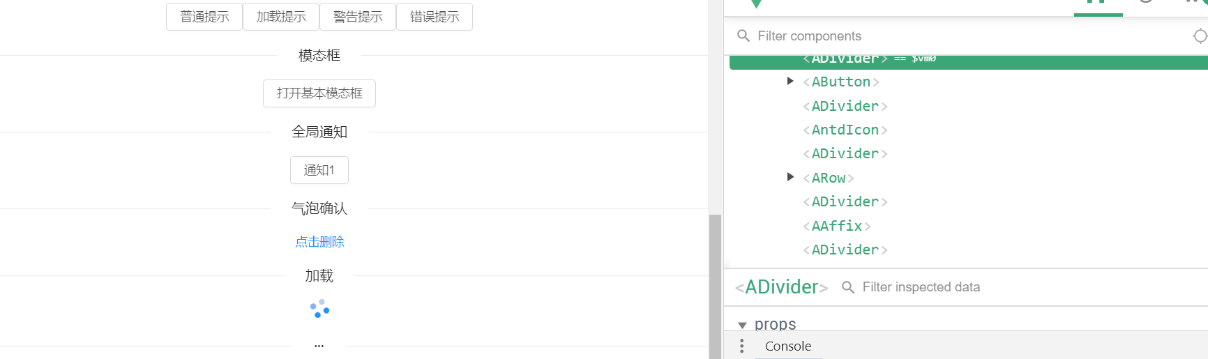
看一下效果: